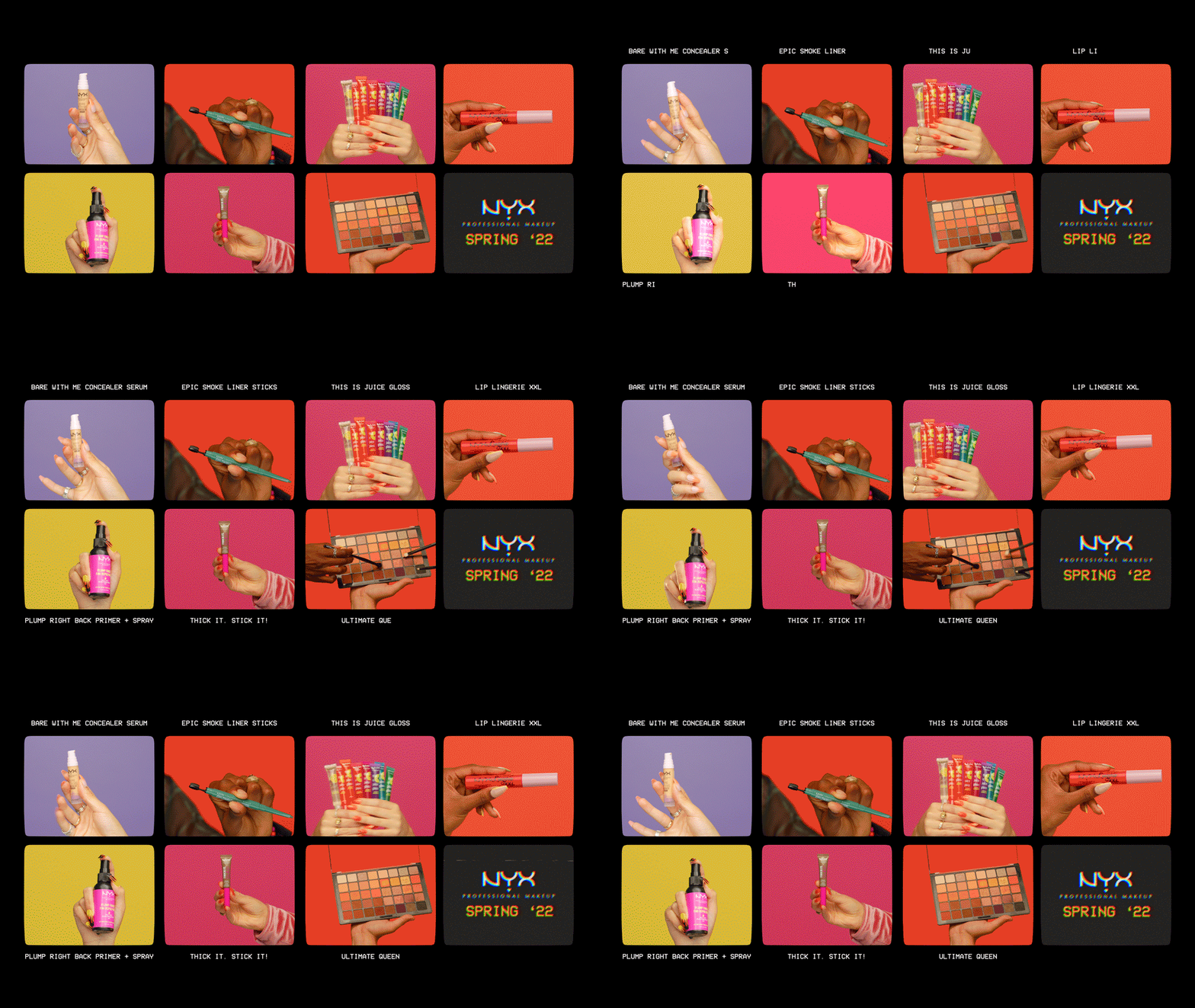
NYX Cosmetics has worked closely with Industrial Color for their past campaigns as IC is the preferred vendor of L'Oréal groups.
Spearheaded by our Associate Creative Director, Jamie Nanquil, we were again tasked with the challenge of
creating hype and excitement for NYX’s latest line of cosmetic products - this time for the upcoming Spring of 2022.
“The NYX Professional writes new rules and leaves their mark on the city.
Self-taught and self-made, they are empowered innovators
who express their creativity through the media they own.
They embody the spirit of LA – its freedom, its boldness, and its colorful personality.
As the Hollywood dynamic shifts, the NYX Professional moves with it,
building communities and creating with inclusivity.”
The target demographic of NYX Cosmetics is that of the average teenager/young adult.
The company celebrates body positivity and represent minority groups of the community.
NYX refrains from retouching their campaign photos & videos to maintain a level of authenticity.
I had the opportunity to work as a motion designer alongside a talented video editor, Chad Hylton who has a great sense of timing and rhythm,
which was important in the process of creating impactful eye-candy videos that leaves the user wanting more.
The footage was shot in L.A. by the production team, and during the post phase the editor and I exchanged notes and selected
spotlight moments where impactful motion graphics come into play to elevate the content of the videos.
NYX’s preferred font of Futura PT is used as the primary typeface and
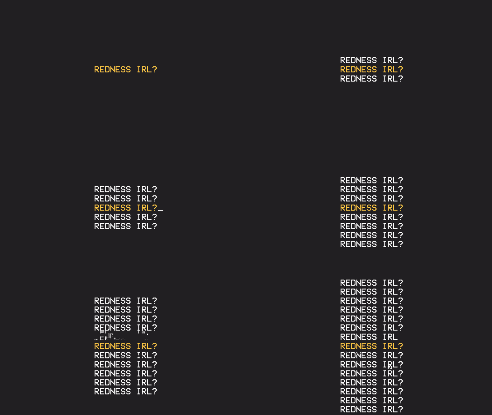
the retro-looking VCR OSD Mono used as secondary for this campaign.
Since we were told to break rules and go big, I wanted to see what I could get away with.
Understanding that the client is expecting to see something fresh, and different from their previous campaigns,
I took a stab at creating loud, bold and flashy animated typography scenes that feature product names.
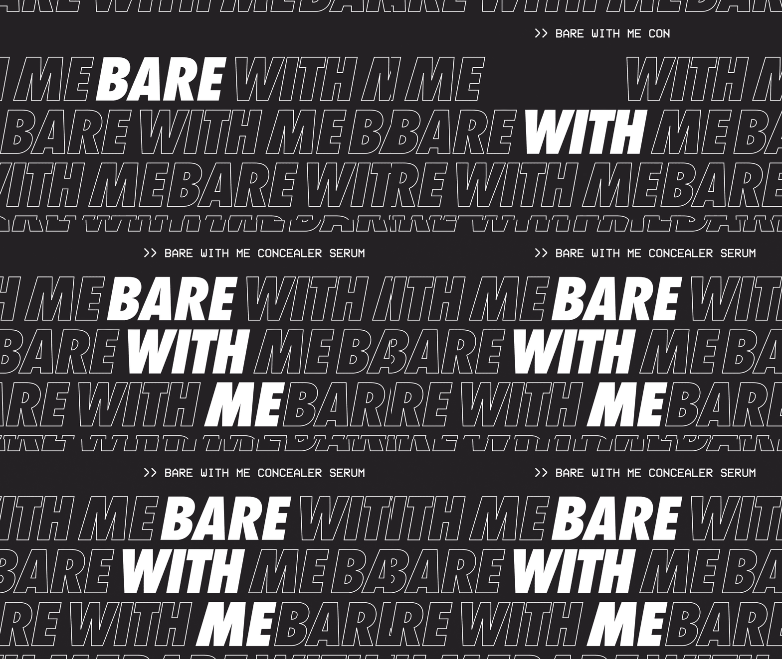
We started out with the edit for NYX’s Bear With Me Concealer. Working closely with the editor,
we blocked out certain moments to cast a spotlight on different styles of kinetic typography.
I had a little too much fun with the creative freedom.
As a designer, I’ve always appreciated the energy of oversized, italicized typography.
For the first motion test I used bold text outlines to fill the majority of the frame,
using them to play the part of abstract lines rather than words meant to be read.
Varying levels of ease contributes to the energy of the animation, and the use of
highly contrasting, flashing text speaks out to the boldness of the brand
while drawing the eyes of the consumer to the product name.
The creatives in our team absolutely loved the energy of the kinetic type working with the music and edit.
Unfortunately, the client decided that this direction had to be shelved as it was a little too much on the loud side to the point of being distracting.
It was competing for attention with the hero product, and we ended up animating the client-provided logo lockups for each product.
The end card design for the campaign borrows its aesthetic from a retro VCR look,
with the use of interlaced lines, subtle chromatic aberration, some noise and a little footage fuzziness.
The camera viewfinder graphic elements were used in previous campaigns -
The motif is applied to create stylized but not too heavy-handed application of video effects.
A ticking digital stopwatch, created with a simple expression, contributes to the energy of the end card without being distracting.
NYX is really proud of the fact that their products are vegan and hence animal cruelty-free.
As mentioned, they like to maintain a level of authenticity but avoiding footage retouching.
Those values are displayed in the form of a scrolling ticker box at the bottom of the end card.
A small window of footage is used in each of the end cards - it’s a 2-3 second spot for any fun, behind-the-scenes moment from the shoot.
This segment can either grant viewers a sneak peek into the personalities of each talent, or provide a different perspective of the scene.
Entertaining but with an authentic vibe.
NYX Spring ‘22 had been a blast from start to end, and very much so a learning experience.
Bright, “fierce” colors, music-synchronized edit
and slick motion graphic elements work in harmony
to create NYX’s latest product campaign.


