

CASE STUDY: KIEHL’S QIXI 2022

COMMUNICATION
Industrial Color’s video team was tasked to create a 15-20 sec hero video and two 6 sec videos inviting consumers to celebrate Qixi 2022 by heroing “his” and “hers” offerings through a modern lens that cues romance. Through the effective use of fun, video game-like graphics and dynamic character animation, our primary goal was to capture and hold the attention of young adults through social media ads.

ABOUT KIEHL’S
Kiehl’s is an American retail brand that started in 1851 as a small pharmacy in Manhattan and grew into one of the world’s leading brands in natural hair and skin care products. The company is especially proud of it’s heritage since it was established in the mid 19th century by John Kiehl. Kiehl’s is today part of the L’Oréal Group and runs more than 250 retail stores worldwide.
Widely known for using clean ingredients, recycled packaging, and sensitive-skin-approved formulas, their unisex packaging design for their products also contribute in their appeal to men.

CONCEPT SUMMARY
Relationships are an adventure: sharing moments, overcoming obstacles, and most importantly, having fun. Together. This Qixi, we’re celebrating couples and that sense of adventure by jumping into a colorful 16-bit universe inspired by retro video games where we play up the fun, the '90s nostalgia, the spirit of competition and the joy of togetherness. And to ensure every customer knows they’re sharing something truly special from a trusted brand, iconic elements of the Kiehl’s world will always shine through.
It’s time to level up your gift giving and show love… with Kiehl’s.

STYLE EXPLORATION

During the early phases of this campaign, I did a little bit of visual exploration for the side-scrolling game. As an artist, I’ve always been inspired and attracted to the clean and sharp appearance of minimalist vector art. The use of parallax motion would fit right in with the vector graphics, and multiple layers of buildings with varying Z-space distances would contribute to the illusion of depth.
It was initially planned to have one world for each character - the red would live in the blue city environment, while the blue character’s game world was to be red.

In the end, Kiehl’s decided that they want to go with something that looked like a video game in the 80s. They provided the following images as style references for the look they were trying to achieve:

INITIAL STORYBOARDS
Designed and put together by Sidney Huang, an Art Director with Industrial Color’s video team. This direction is based on a retro, side-scrolling arcade game that employs heavily stylized pixel artwork.

In the earlier drafts of the Qixi storyboard, we were relying on visual elements from the popular video game, Minecraft. The plan was to use background image assets such as buildings and infrastructure illustration from stock websites, and to show each character in their own world simultaneously in two halves of the frame.
The buildings in the earlier storyboards were drawing attention away from the hero characters with their level of contrast. There was also the issue of design cohesion with the collision of the 3-dimensional-looking characters, the airbrushed pixelated background and the high resolution product images.
FINAL STORYBOARDS


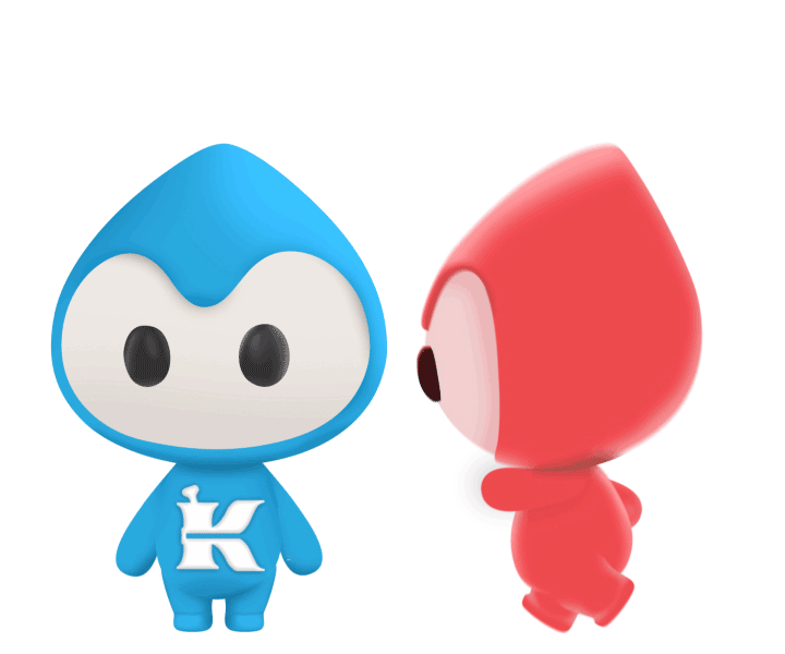
Kiehl’s product shots are integrated into the 2D side-scrolling video game world, presented to the viewer as power-ups hidden in gift boxes. Each character collects gifts which are then exchanged with one another at the end of the ‘game’.
PROBLEM: BUDGET
Client wants to use a pair of animated CG characters for their campaign, but lacks the budget for 3D character animation.

SOLUTION PT1: PHOTOSHOP
Using screenshots of a single 3D character model in both side and front views as reference, the characters were re-created in Photoshop.
This was achieved by blocking out each body part as its own layer and then applying shadows to provide a sense of depth.
The PSD layers are then imported into After Effects.

SOLUTION PT2: AFTER EFFECTS
Each body part is imported into AE as its own layer, had their anchor points adjusted so they’re around the joints and then parented accordingly, with the torso being the main parent.
Since there was no demand for complicated animation, I decided not to use FK or IK rigs. The two main looping animation were running and jumping, which were achieved by just a few keyframes on a loopOut(”pingpong”) expression.
Keeping in mind the playful nature of this concept, the characters were animated with deliberate exaggeration.
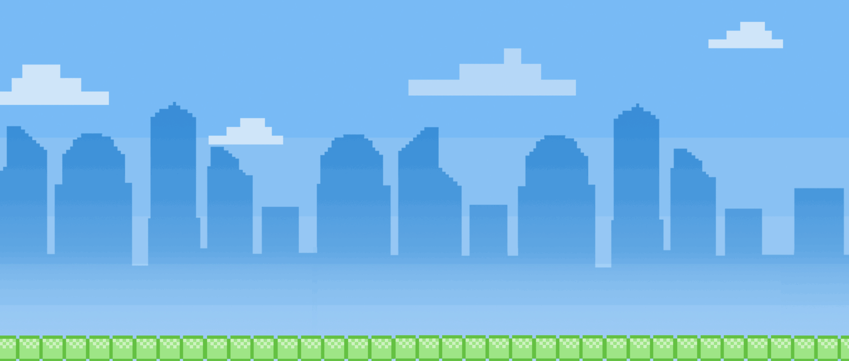
SCENE ENVIRONMENT
The updated version of the pixelated metropolitan background was once again designed by the art director. It uses simplified silhouettes of a variety of buildings, a Super Mario style of blocky platform and a layer of pixelated clouds. The design simplicity works well with the pastel colors to create an intriguing background that does not vie for attention with the hero elements.
The background elements were then imported into After Effects and converted into 3D layers, with the blue gradient colors of the sky, the silhouetted buildings and the clouds having varying Z-space positions. A 3D camera was created for the scene, moving consistently on its X-axis to create an illusion of depth and parallax as seen below:
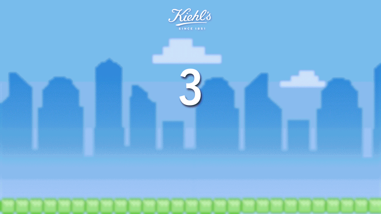
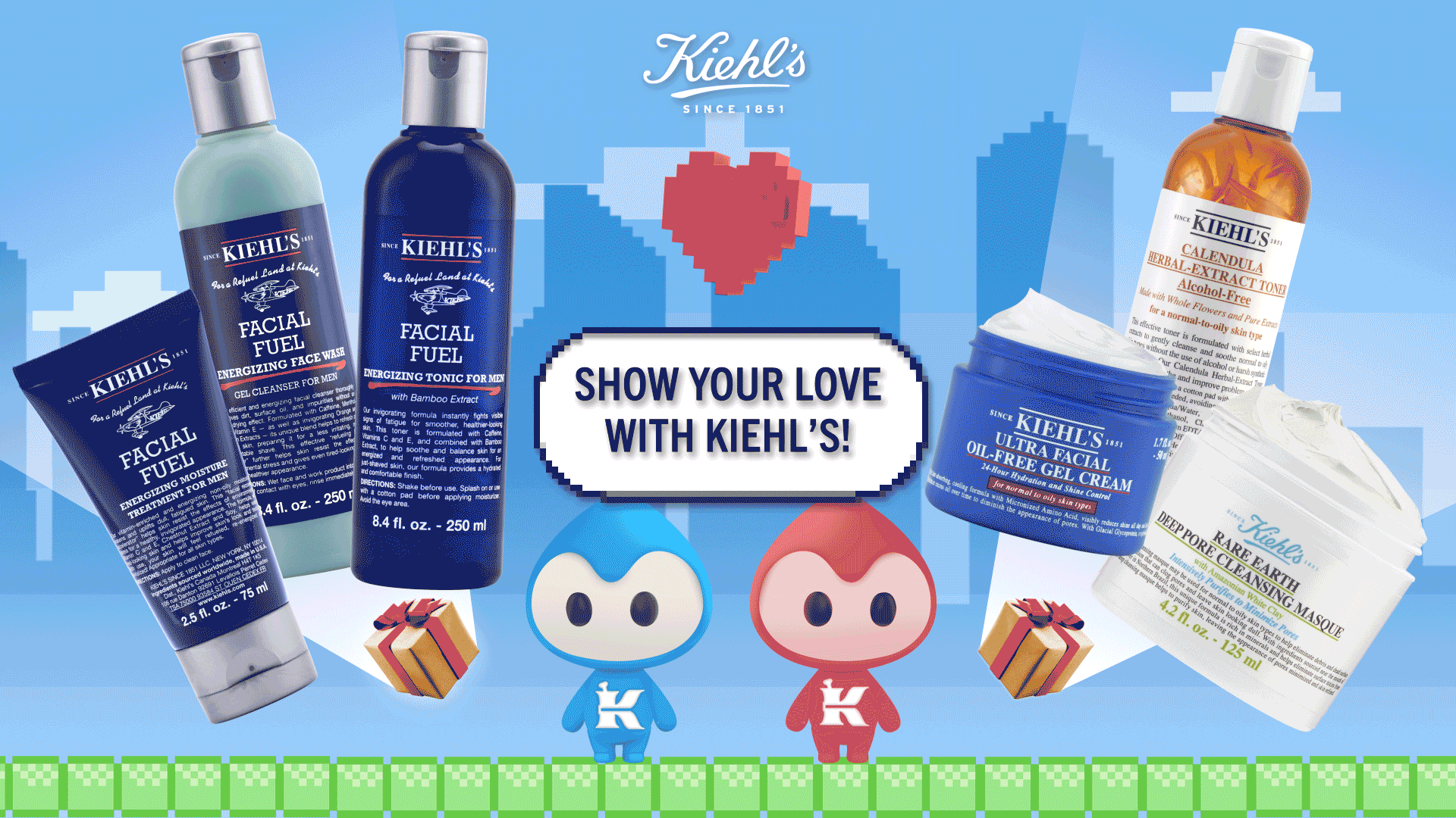
FINAL PRODUCT
30s HERO VIDEO
10s SHORT ANIMATION
10s ANIMATION WITH PHOTOGRAPHY FROM RETOUCH TEAM (BLUE)
10s ANIMATION WITH PHOTOGRAPHY FROM RETOUCH TEAM (RED)