

CLIENT
Benjamin Moore & Co., also known as Benjamin Moore, is an American manufacturer of premium and commercial paints, stains and other architectural coatings. The company was founded in 1883 in Brooklyn, N.Y., and is currently headquartered in Montvale, N.J.
BRIEF
Industrial Color collaborated with FIG, an internet marketing agency based in New York, NY. Directed by NY-based artist Suzanne Saroff, we sought to create eight :30 second video stories that highlight emotions and enticing feelings that Benjamin Moore paint colors evoke.
SUPERS & TYPOGRAPHY
For this project, we used Moderat, a contemporary sans serif typeface characterized by a combination of geometric shapes and some edgy accents. I am personally a fan of the legibility and anatomy of the Moderat typeface and had a great time working the type into the beautifully shot scenes of the edit, as displayed in a few examples below:


CHALLENGE: END CARDS
Each of the eight collection videos required a unique end card. The idea is to have the camera zoom out from the last shot of the video to a display of paint cans, with each showcasing a scene from the collection. To give a feeling that these scenes are endless, and that the color collection has infinite options, some of the scenes were required to loop seamlessly.
Here’s a quick sketch of the proposed end card from Suzanne, taken from the original pitch deck presented to the client:

Endcards: Preliminary Motion Tests
Early in the process, I rendered a few motion tests to show how each of the endcard will reveal, for internal eyes only. One of the issues with the sketch above is that we do not have a central paint can to zoom out from. This means that the camera will have to perform an awkward X & Y position shift to get the Benjamin Moore logo in the center.
End card: Layout & animation options
I worked around with the position and scale of the paint cans, as well as transparent solids to create 3 layout options for the agency. One of my recommendations was to have a central paint can, in order to maintain symmetry in the end card.


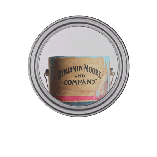
The client decided to proceed with this particular paint can layout and animation:
As the editors get their first drafts up, I was provided with footage from the video spots. Working with the art director from FIG, we refined the end card design and animation with the relevant footage.
END CARDS: BACKGROUND + SHADOW TREATMENT
With Benjamin Moore, we know our client appreciates the beauty of subtlety. Using the brand’s classic Symphony Blue, I created a textured canvas and multiple light sources in motion. As the camera zooms out, I wanted to create an effect of cohesive motion using the shadows cast by the paint cans. An illusion of contact shadow is created by using an additional masked shadow around the base of the paint cans.
I applied a CC Radial Fast Blur on the shadow with the following expression:
temp = thisComp.layer("LIGHT").transform.position;
[temp[0], temp[1]]
I was able to create a main light source and have the shadows respond to the position of it, rather than having to tweak each shadow manually, which probably saved me hours of work since I had to adjust the light source a few times per client request.
RIM HIGHLIGHT + SHADOWS
For additional depth, I animated highlights and shadows on the rims of each paint can while taking reference of the position of the light source. Subtle lighting effects like such increases the production value of the animated scenes without stealing attention from the main content that exists within the cans.
FINAL END CARDS
Here’s a compilation of the 8 end cards from each spot in the 16x9 aspect ratio.
FINAL END CARD VERSIONS
9x16 and 1x1 versions were also created for mobile and instagram. The paint can layout was essentially rotated 90 degrees to fit perfectly in a 1080 x 1920 px frame, and some adjustments were made to the positioning of certain scenes for visibility purposes.
Thanks for making it this far down.